Hello!
We’ve been working a lot on the variety show we’re putting on through our homeschool co-op. My mom is the main one behind it all, with help from some other moms. It’s coming up fast, it’s now in about a month!
One of the things I like about how my mom is doing this variety show, is that the students are in charge of more than we have been in other shows we’ve done. Everyone is in a committee, and each committee helps with certain aspects of the planning and logistics of the show. I’m in the Communication and Design Committee, along with three other people. I’ve ended up doing most of the designing, for the logo, the flyer, the tickets, and now the T-shirts, all with help from my dad. This T-shirt is what all the students will wear for the show that night, as well as the adults that are helping. I’ll share a bit more about it below.
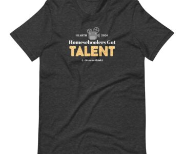
Here is the original logo that we’ve put on our flyers and tickets, because that’s what the T-shirt design started as, and then below is the T-shirt.

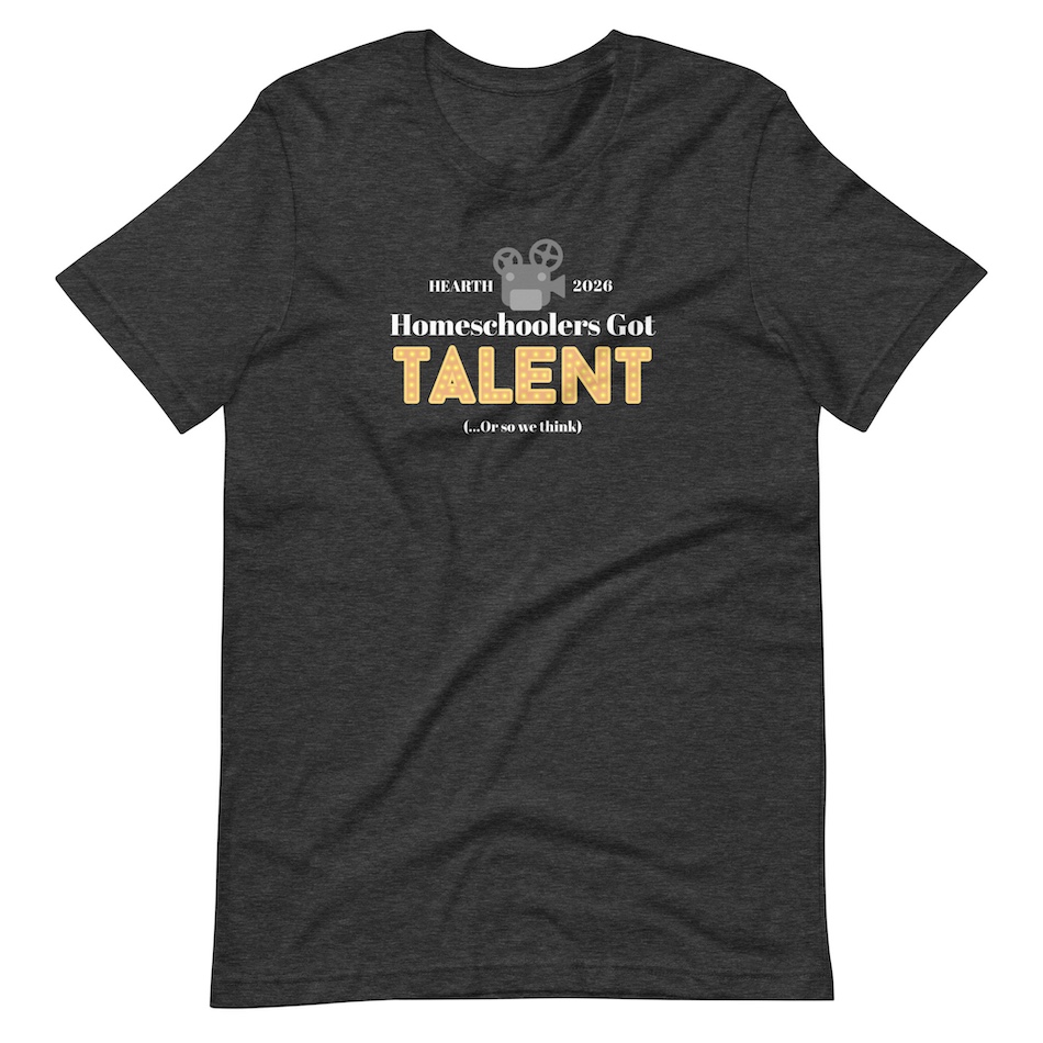
What’s something you liked about it (and why)? I liked the reward of the finish product! I really love how it turned out. My dad definitely helped with a lot, so it wasn’t just me. One of the shirt color options our committee was thinking about was some sort of red, but my dad and I saw this heather gray and I thought it looked a lot nicer than the red options. I took this design from the logo and my dad suggested that we take out the red curtains. I also changed the top font. Our committee wanted to put the “(… Or so we think)” on the back, but that didn’t work out so I just added it to the front. I think that looks pretty good. I really like the “HEARTH” and “2026” at the top too. And my dad was the one to make all the pieces fit into place so nicely, the projector and all the words on top, I wasn’t sure about it at first but then I saw how that makes it all look so much nicer.
What’s something you disliked about it (and why)? The actual process wasn’t my favorite. This is the case for most design projects I do. I don’t like trying to figure out what to do and what looks good and then all the tweaking and straightening at the end. I had a hard time deciding what font to use for the white words— I wanted to be happy with it all. It was a lot of pressure. It was kind of stressful and meticulous for me, so not all of it was very enjoyable. I had my dad’s help, so that made it better. I did like it when it was looking good and came together, then having it done and the feeling of loving the final T-shirt. This reward throughout and at the end does oftentimes make me feel better at the end of design projects.
What was your biggest takeaway or lesson? One of my biggest lessons was learning about how to fit things into place like my dad did. I had the projector more centered and then the “HEARTH” and “2026” spaced out further on either side, also more centered. He said it was kind of like a puzzle, and your eye wants to be able to group things together, not just have them floating around. I learned that sometimes it’s better to prioritize this over having things centered. He made the projector bigger and moved it into the little groove of the “Homeschoolers” word, and then lined up the “HEARTH” and “2026” with the middle of the projector and moved them closer to it. I think this makes it look a lot better and easier to look at.
What is something you’re curious to learn more about as a result of this experience? I’d like to learn about other design tips, like the one my dad taught me. I design different stuff here and there, and I’m sure there’s many other tips out there that would help make what I do better.
I’m looking forward to wearing this shirt for our show!
Thanks for reading!
God bless!
Lucy